“Good design is like a refrigerator – when it works, no one notices, but when it doesn’t, it sure stinks.” – Irene Au
We at Hoji have always prided ourselves in making technology that is pleasant and easy to use. But even a good thing can be made better.
Although we are always making new releases of our mobile app with new and improved features, we recently made a significant enough change that we thought it is worth explaining. But don’t worry, it actually makes your workflow a lot more intuitive.
Previously, the app offered 2 tabs on the home page i.e. Forms and Records. The Forms tab contained the data entry forms in your project, and the Records tab contained the records you created as you filled out the forms. This simple workflow has served you well for the last 2 years, but it is time to move on.
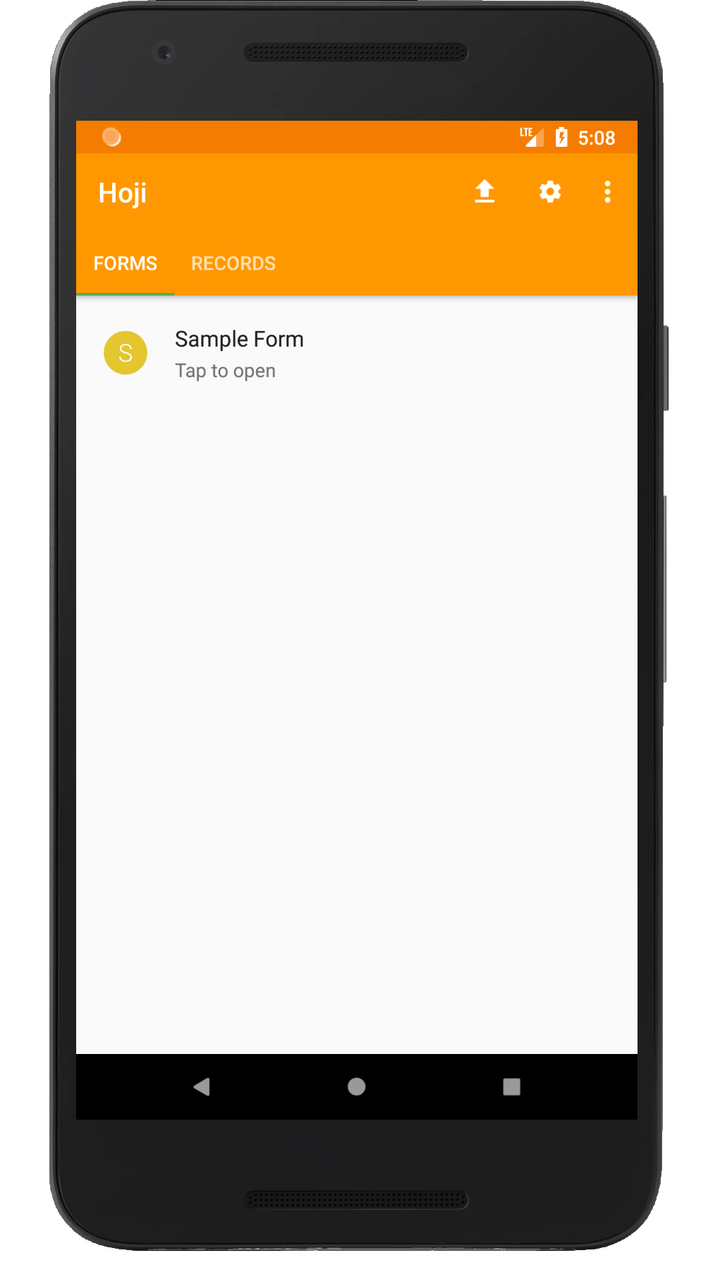
Fig 1: The old layout
One weakness with the old layout was that it didn’t make it immediately apparent what happened when you filled out a form, which confused some users, especially new ones. To retrieve the records created as a result of filling out a form either partially or completely, you needed to go to the Records tab and perform a search.
Electronic mailbox
For version 8.2.1 of the app , we have upgraded the layout to mimic the familiar electronic mailbox workflow, which should make the data entry process as intuitive as working with email. Think of your favorite email client, like Microsoft Outlook or Gmail. If you create a new email and, before sending it abandon it as work-in-progress, it is automatically saved in the Drafts folder. If you send it but there is no connectivity, it is saved in the Outbox folder. Finally, if and when the email is sent successfully, it is stored in the Sent folder.
That’s all you need to remember to understand the new layout on Hoji.
While the app has always saved work-in-progress as drafts and separated sent and unsent records, the old layout didn’t make these distinctions readily apparent. In the new layout, the 3 folders, Drafts, Outbox and Sent are integrated into the homepage, along with badges to show you how many records are in each folder.
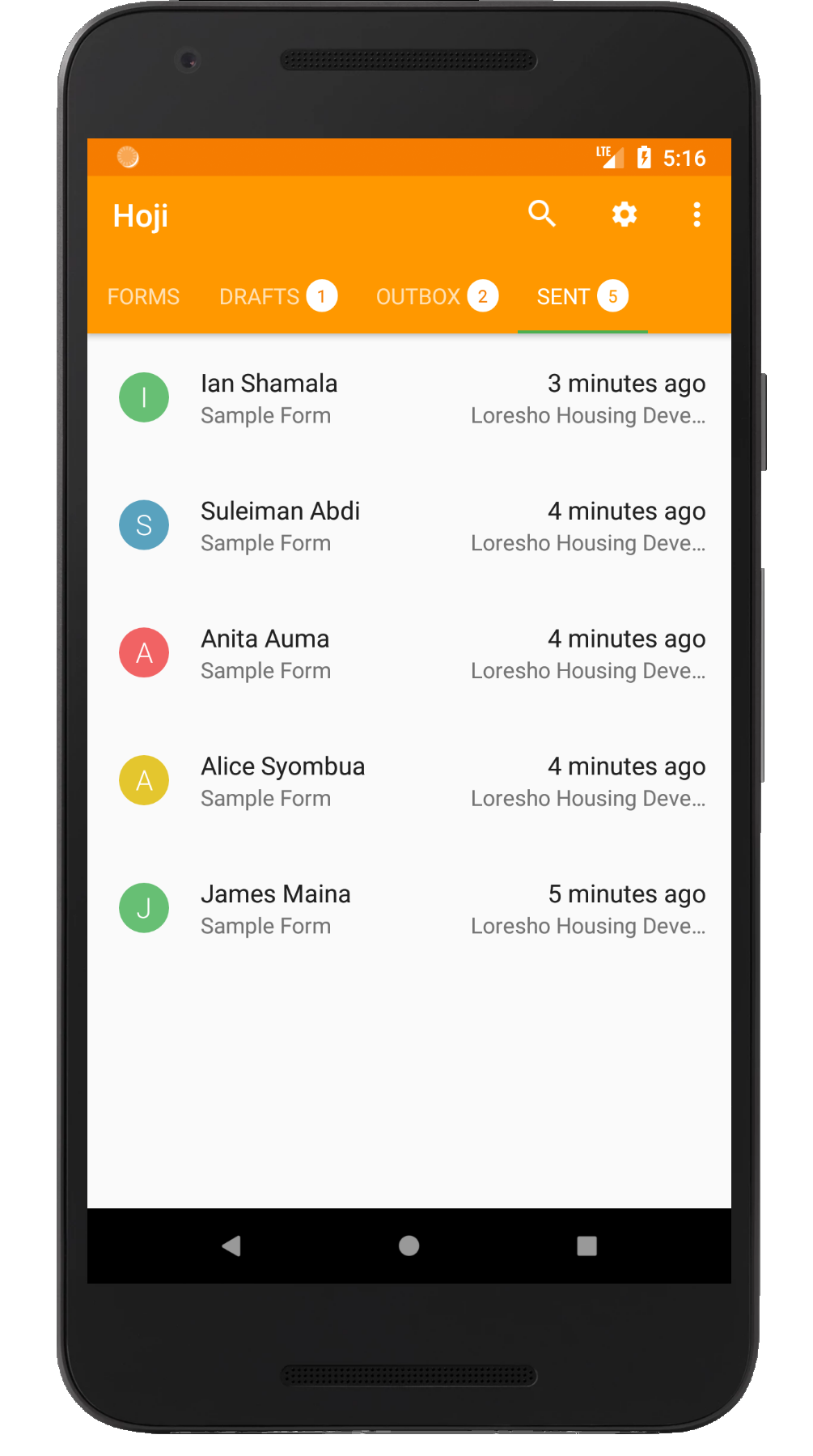
Fig 2: The new layout
So, are we losing the old and trusty search feature?
Not at all! We recognize that it is very handy for retrieving specific records, especially when you have accumulated hundreds of them. So, all we did was move to the search button at the top of the screen, and it looks and works exactly like before.
Test-mode
The other important feature that we’ve added is test-mode. Again, Hoji has for a long time now supported the ability for projects to be operated in test-mode. This allows users to submit dummy data for the sake of testing, training or practice, without contaminating real project data.
However, test-mode has previously been offered as a centralized feature, configurable only by the project administrator. Individual enumerators did not have the ability to switch their own test-mode on or off. Not until now.
The test-mode feature is now decentralized, and any user can decide for themselves in what mode they want to operate. So the next time you need to show off Hoji to your friends after work, just switch on your test-mode and enter whatever data you like. It won’t contaminate your real project work!
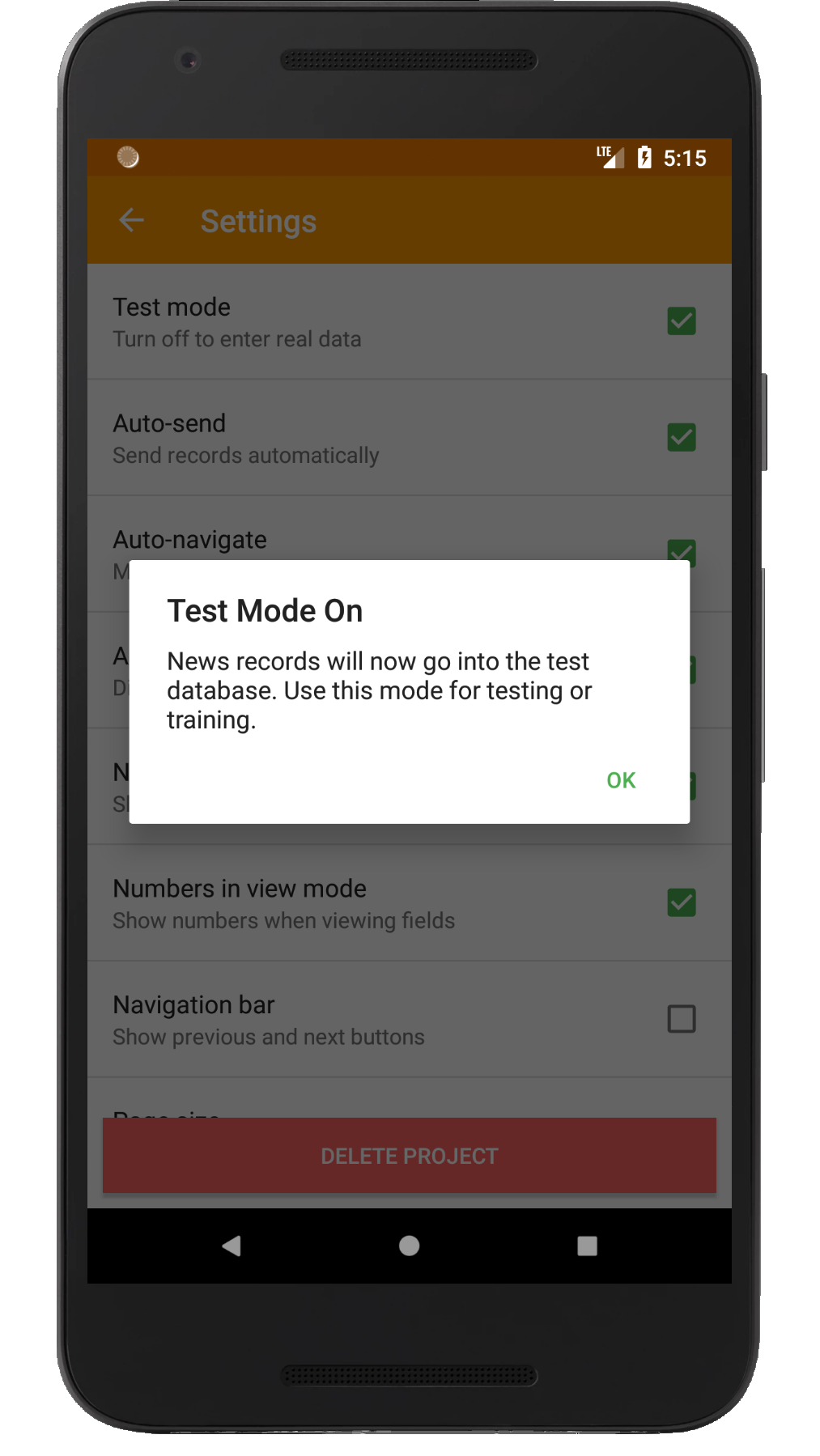
Fig 3: Setting test-mode
We hope that you will enjoy using this new version of Hoji as much as we enjoyed creating it. If you haven’t already upgraded to the latest and greatest version, follow this link to do so. As always, let us know what you think in the comments section below.
Have a great week!
Wow! This is definitely a lot easier to use. Keep up the good work!