“There is no such thing as information overload. There is only bad design.” – Edward Tufte
It feels like data is everywhere these days. And it is. Few reports are complete without some form of data presentation. Eye-catching visualizations can be the difference between a dreary report and one that is both easy and informative to read.
Sometimes, an otherwise great presentation can be ruined if the wrong means of depicting information is selected. In this post, we’re going to review 4 common (and 1 not so common) data visualization mistakes that may be undermining the quality of your reports.
1. Pie charts with too many slices
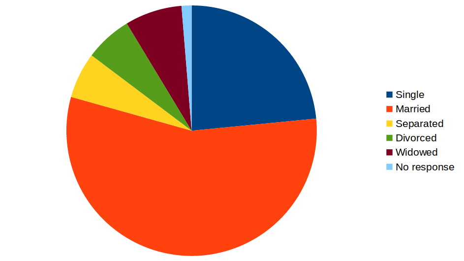
There’s no denying that the trusty pie chart is a staple of data visualization. Analysts love its ability to show proportions in one simple, easy-to-read graphic. The size of each slice corresponds to the proportion it represents. However, research has found that the human eye is not very good at perceiving differences in angles or area.
 |
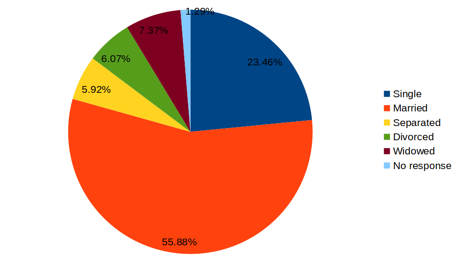 |
In this example, it is difficult to estimate the difference between Separated, Divorced and Widowed. Adding data labels mitigates the issue somewhat, but it also crowds the pie chart and makes it look too busy.
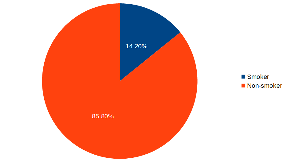
For this reason, pie charts are a poor choice for anything more than a few categories. But how many categories are few enough? Well, expert opinion is divided. Some people say anything below 5 to 7 categories is okay. Others think that pie charts should be avoided altogether, in favor of bar charts and frequency tables. My personal rule of thumb is to use pie charts strictly for binary data i.e. data with only two mutually exclusive categories.
 |
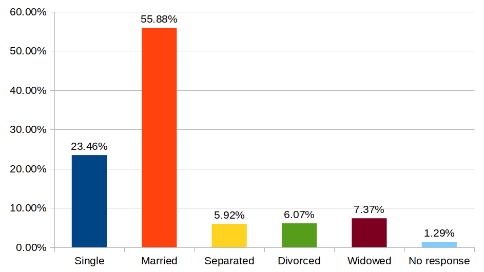 |
The example above shows a clean and effective pie chart depicting binary data. The marital status data from the previous example is displayed a lot more meaningfully using a bar chart.
2. Bar charts with too many bars
If pie charts are the show horse of data visualization, bar charts are the workhorse. Like pie charts, bar charts are terrific for depicting proportions across categories. Unlike pie charts, however, bar charts can be used to represent both mutually exclusive and independent categories.
On major advantage of bar charts over pie charts is that they rely on bar length instead of slice area and angles to show variations in proportion. Our brains perceive length differences much more readily than they do angles.
However, even a good thing can be overdone. Too many bars in a chart can make it difficult to compare differences between categories. It can also lead to crowded labels that are difficult to read. My recommendation is to use bar charts for 10 categories or fewer. Anything above that belongs in a frequency table.
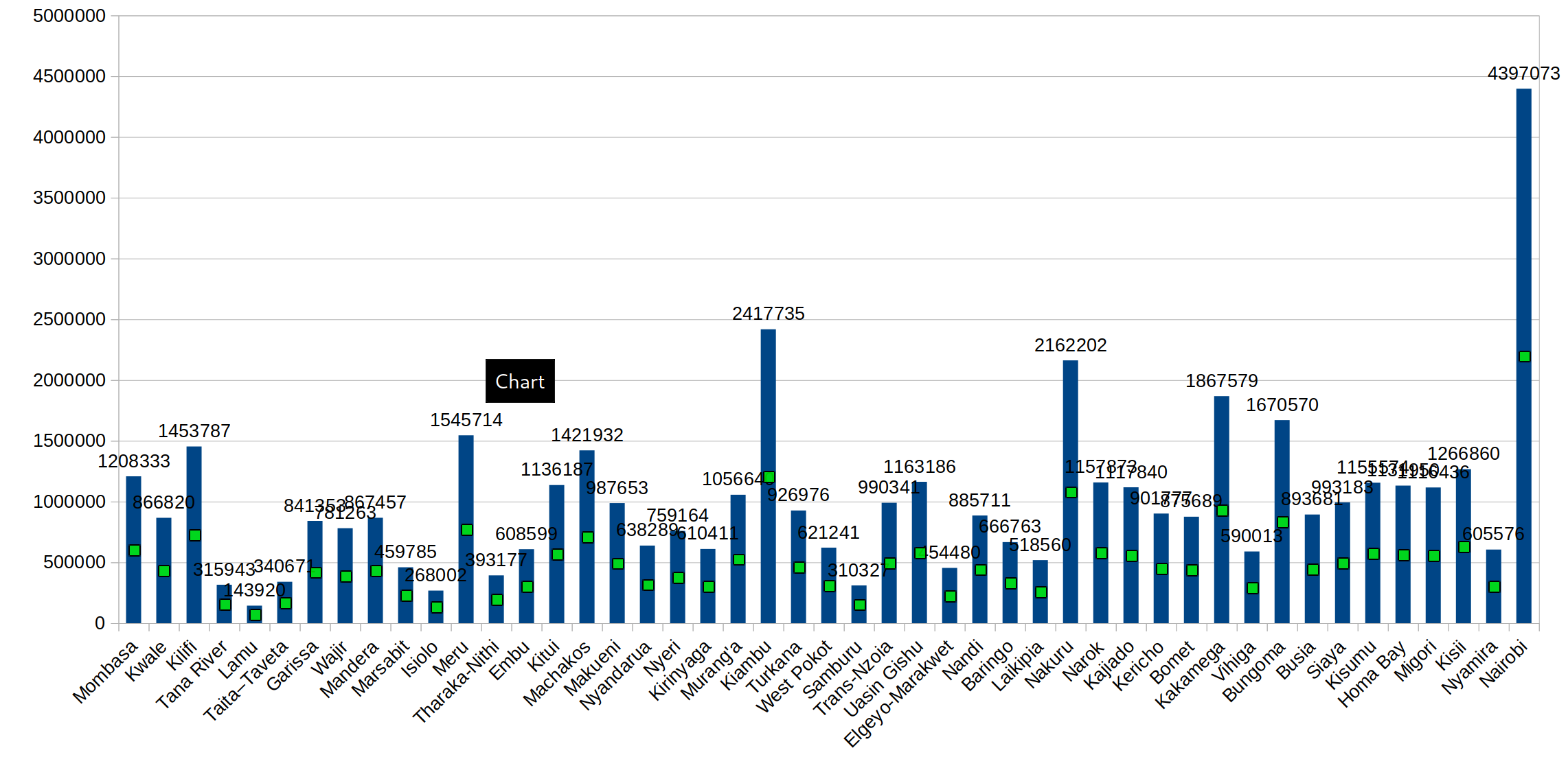
This example shows a consummately atrocious bar chart, depicting all the 47 counties in Kenya and their populations (2019). It should be a hanging crime!
3. Low contrast colors
Colors can vastly improve the ability to quickly read and interpret a chart. Using vivid, high-contrast colors for different categories is an easy way to deliver outstanding data visualizations. In practice, this means that you should avoid placing colors that appear beside each other on the color wheel next to one another in your charts.
Instead, colors that are opposite each other on the color wheel provide the maximum possible contrast. You should try to get as close to this ideal as possible, while taking into account secondary considerations such as branding.
|
 |
A high vs low contrast rendering of an otherwise well designed pie chart. Notice the difficulty with reading the low-contrast rendition.
4. 3D charts
Nothing in a data presentation screams “rookie” more than a 3D chart. It is one of those things where “just because you can doesn’t mean you should”. 3D charts are visually heavier, difficult to read, and sometimes downright misleading. Their only claim to fame is that they tend to be more arresting than a 2D plain Jane.
|
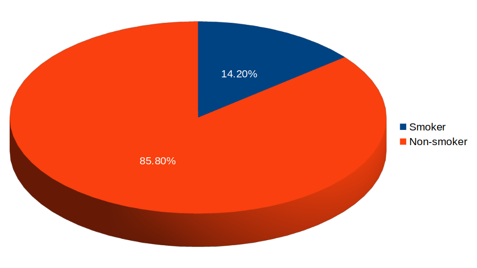 |
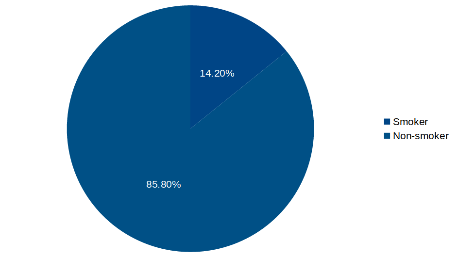
Notice how the 3D chart makes the Non-smoker slice appear somewhat larger than it really is, because of the extra “weight” on the rim.
Perhaps the only place where 3D charts make some sense is in journalism. In a newspaper or magazine, standing out visually can trump being functional. But even here, caution should be exercised.
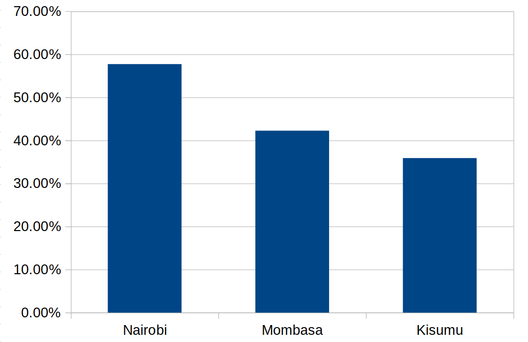
5. Truncated bar charts
Okay, I will admit that this isn’t actually a common mistake, but you still see it here and there. A truncated bar chart is one where the y-axis does not start at zero. The problem with truncated bar charts is that small variations between categories can be distorted so that they appear much larger. As a result, without carefully examining the y-axis, it is easy for a casual observer to make wrong conclusions.
 |
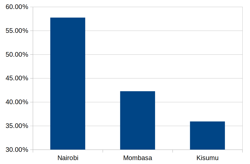 |
Both charts above depict exactly the same data. However, notice how starting the y-axis labels at 30% distorts the differences between categories.
Although it is sometimes an honest mistake, this technique is often used to deliberately misrepresent information. So you want to be on the look out for it, lest you too be fooled.
There you go! What other data visualization mistakes do you think we should all avoid? If you enjoyed reading this post, please share it. It’s always appreciated.
good updates
great knowledge on presentation
Thank you
this is a good article 🙂
Inspiring update
this is great and thanks a lot i have learnt
Very informative article
I actually enjoyed the articles.
its a good update. keep us posted
Thanks for the updates
Perfect
Informative
It’s eye opening update
Nice update looking forward for more
Informative. https://www.hoji.co.ke/5-common-data-visualization-mistakes-to-avoid/
It’s quite informative