“To find signals in data, we must learn to reduce the noise – not just the noise that resides in the data, but also the noise that resides in us.” – Stephen Few
Last month, we discussed some tips on how to design more effective questionnaires. In today’s post, we’ll walk through a few basic ideas on analyzing and visualizing your data to reveal insights and drive smart and timely decision making. We shall restrict ourselves to univariate descriptive statistics i.e. describing individual variables in the dataset. Multivariate analysis and inferential statistics are beyond the scope of this post.
Quantitative survey data can be classified into 2 broad types, namely; numeric and categorical data. Numeric data measures attributes such as age or height. It can also measure counts e.g. number of children. Categorical data represents characteristics such as sex or marital status. Categories may be “coded” using numbers, like 1 for Male and 2 for Female, but such numbers are merely for convenience and have no mathematical meaning. You should not average or sum them up, for example.
Numeric data can further be classified as discrete or continuous. Discrete numeric data assumes whole number values. Counts are a common case of discrete data. For instance, the number of children that a respondent has assumes values like 2 or 3, but not 2.3. On the other hand, continuous numeric data can assume any numeric value, including decimals. Many measurements, such as weight or height are continuous in nature, with values like 87.3 kilograms or 1.85 meters being typical.
Categorical data can also be further broken down into sub-types. Binary data describes categorical data that assumes one of only two possible values. A good example is sex i.e. male or female. Ordinal data describes characteristics that have an inherent order e.g. education level; where primary education is lower than secondary education which is lower than tertiary education. Nominal data, such as nationality, is categorical data that has no inherent order.
These different types of data lend themselves to different kinds of analysis. Let’s examine them below.
Numeric Data
Before analyzing numeric data, it is important to make sure that all measures in the dataset are expressed in the same units of measurement. Do not, for example, mix height in meters and height in centimeters in your analysis. When analyzing numeric data, it is not necessary to make any distinction between discrete and continuous numeric data. It is all treated the same.
There are 3 main ways to summarize numeric data, namely; a) measures of central tendency b) measures of variability c) measures of shape.
Measures of central tendency are a class of summary statistics that tell us the “central position” of a given dataset. They include the mean, median and mode. The mean, also commonly known as the average, is simply the sum of all values divided by the number of values in the dataset. The median is the middle value in the dataset, sorted in ascending order. The mode is the most frequently occurring value.
Measures of variability describe how much “spread” there is in the data. For example, a classroom where all students are the same height exhibits no variability. However, if the classroom has a varied combination of giants, dwarfs and students of ordinary height, then it exhibits wide variability. Range is the simplest measure of variability, and is defined as the difference between the largest and the smallest values in the dataset. The variance is the average squared difference of each value from the mean, and the standard deviation is just the square root of the variance. Low variability indicates that the values in the dataset are generally close to the mean. Conversely, high variability indicates that the values are spread out over a wider range.
Measures of shape describe the distribution of of the values in the dataset. A histogram is a great way to visualize the distribution of a numeric dataset. If the distribution is symmetrical, then we say that it has a skewness of zero. If it is skewed to the left, we say that it is negatively skewed. If it is skewed to the right, we say that it is positively skewed.
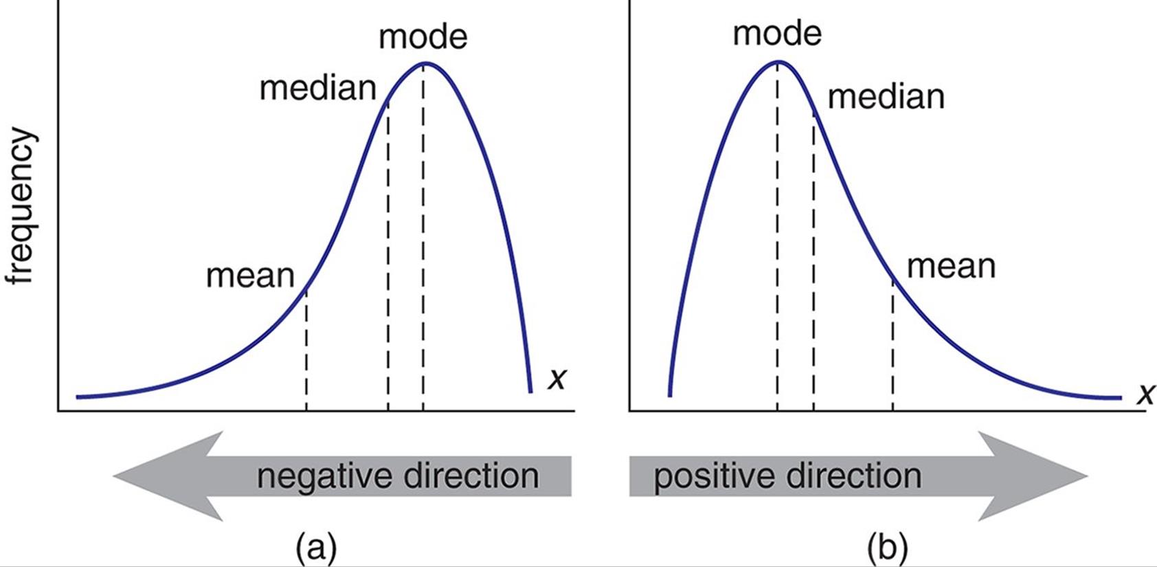
Fig 1: A visualization of positive and negative skewness
Kurtosis, on the other hand, measures the “peakedness” or “tailedness” of the distribution. The normal distribution has a kurtosis of 3. Kurtosis is normally stated relative to the kurtosis of a normal distribution. This measure is obtained by subtracting 3 (the kurtosis of the normal distribution) from the actual kurtosis of the distribution under examination. The resulting measure is called excess kurtosis, but is often simplified to just kurtosis. A distribution with a tall peak and long tails has a positive excess kurtosis, and one with a flat peak and short tails has a negative excess kurtosis. I will not delve into the relatively more complicated formulas for calculating skewness and kurtosis here.
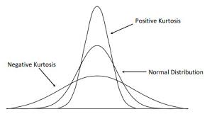
Fig 2: A visualization of positive and negative kurtosis
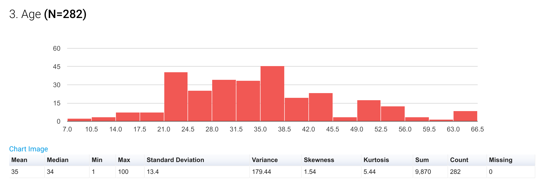
Fig 3: A histogram showing the distribution of a numeric variable, along with a table of summary statistics
It is important to note that if a numeric dataset has a reasonably symmetrical distribution, then the 3 measures of central tendency will tend to converge, and any one of them may be used to accurately estimate centrality. If the distribution is asymmetrical, however, the mean is a poor estimate of central tendency because it is very sensitive to outliers i.e the extreme values in the data set will tend to draw the mean away from the center. In this case, the median and the mode and far better estimates.
Categorical Data
Categorical data is a lot easier to describe than numeric data. The first step is to prepare a frequency distribution table. A frequency distribution table simply lists each characteristic, along with its frequency i.e. the number of times it appears in the dataset. A 3rd column, expressing the frequency as a percentage of the total may also be included.
It is important to consider whether the individual categories that constitute the variable are mutually exclusive or independent. For example, country of birth is a mutually exclusive variable because a respondent can only have one country of birth. Favorite colors, on the other hand, are independent categories, as a respondent may have more than one favorite color. For mutually exclusive categories, the individual frequencies for each category add up to the total number of respondents. For independent categories, the individual frequencies of each category do not add up to the total number of respondents. However, their percentages must be calculated against the total number of respondents.
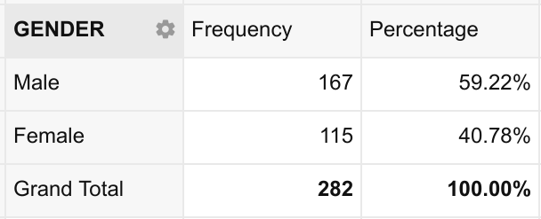
Fig 4: An example of a simple frequency distribution table
The frequency distribution table, by itself, is sufficient for describing the distribution of categorical data. However, it is often easier to visualize the distribution using a pie-chart, column chart or bar chart.
Pie-charts are a great tool for visualizing binary data. It is easy for the human eye to perceive how 2 categories stack up against each other and as parts of a whole when presented in this way. However, pie-charts tend to be a bad choice for more than a few categories. My personal rule of thumb, and which I strongly recommend, is to use pie-charts only for binary data. This means that your pie-charts should have only 2 slices. You may include a third slice if you have to account for a “Missing” category.
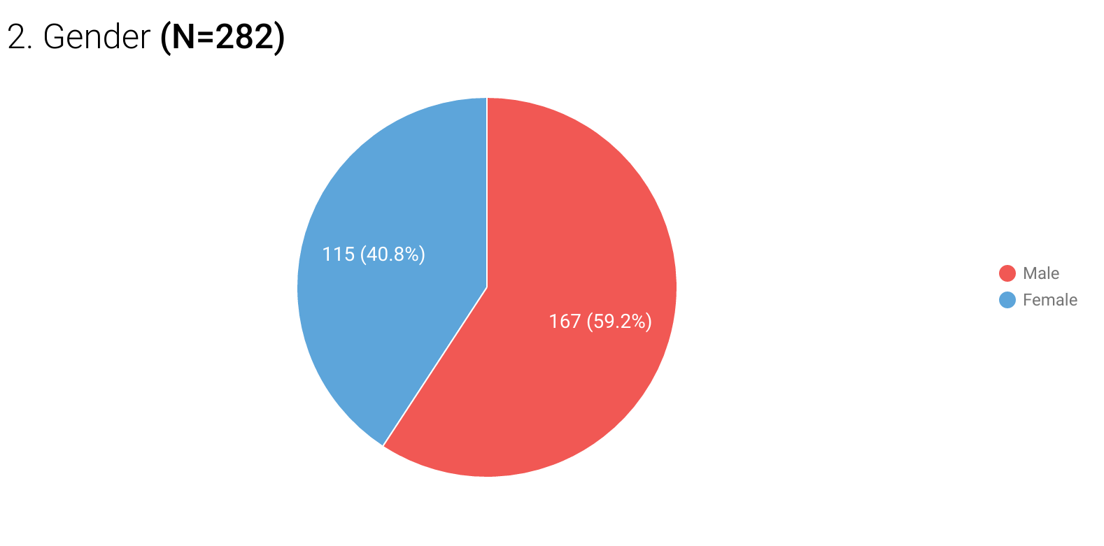
Fig 5: Sample binary data presented in a pie-chart
For 3 up to 10 categories, column or bar charts work better because the human eye is much better at perceiving differences in height or length than in angles. Above 10 categories, it is just neater to use the frequency distribution table itself to avoid crowded columns or bars.
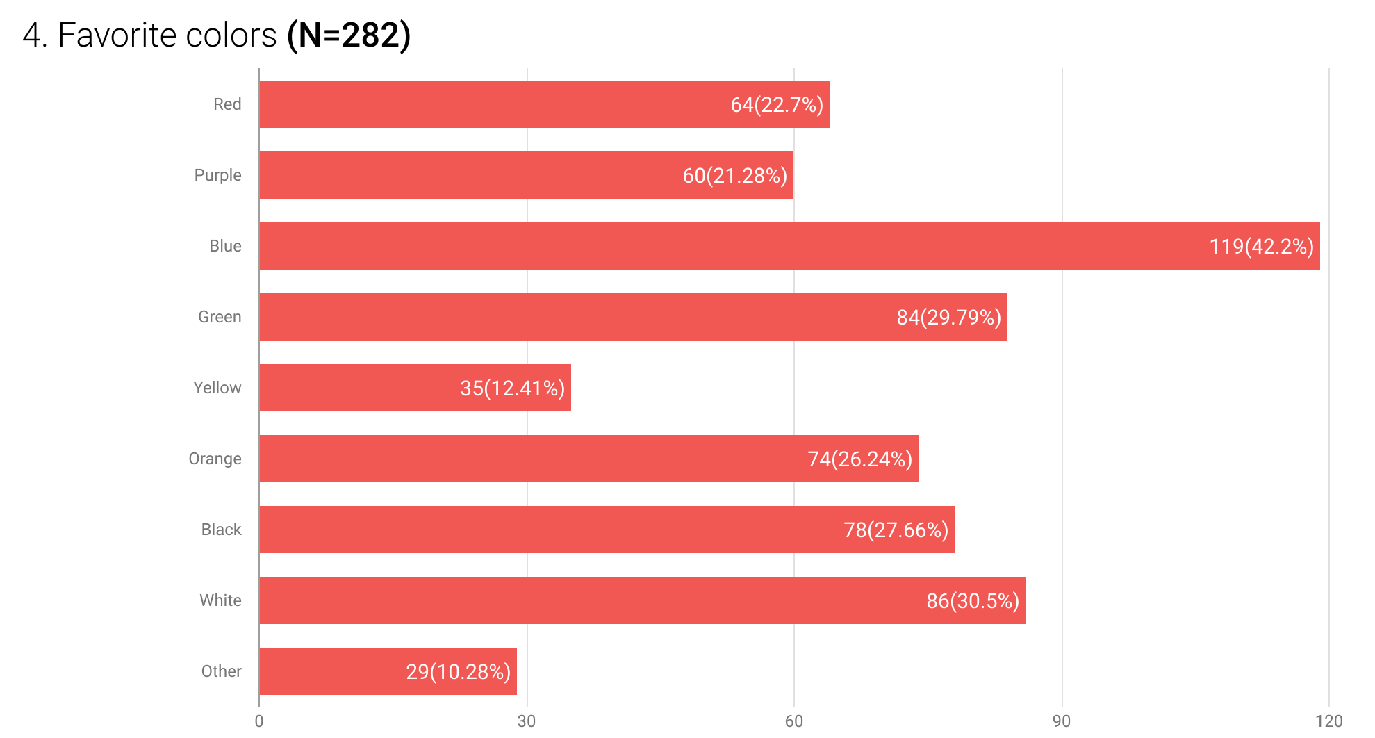
Fig 6: Sample categorical data presented using a bar chart
One common mistake to be aware of when using charts for visualization is presenting them in 3D. While they may look fancy from an artistic point of view, 3D charts distort the visual perception of the spatial relationships that form the basis of accurate interpretation of data.
Conclusion
I hope you have found this coverage of basic data analysis useful. One of the key benefits of choosing Hoji for data collection is that it automatically runs all of the above analysis and more, leaving you only the interesting work of deriving meaning and making deductions from your data.
Have a great week!
wow great piece,i hope in future you can also include inferential statastics but for descriptive its perfect.
Thanks Hachu. I will definitely consider writing about that sometime sometime in the future.
Your presentation is accurate and insightful, just a comment on the choice of color, visualizations should always take into account those with color vision deficiency commonly called the color blind
Thanks for your suggestion. We deliberately use high contrast colors in our visualizations, and specifically avoid using red and green together, which is a common type of color-blindness. Below is an example of what our charts look like. Any specific suggestions for further improvement are definitely welcome.
very educative
I really appreciate
thank you
This is a very good resource. I like it