In Part 2 of this series, we examined a few pivot table configurations and the types of summaries that can be created using them. We also discussed the concept of measures and dimensions. In this installment, we shall run through the actual process of preparing pivot tables.
There are many tools for creating pivot tables. Perhaps the most popular among them is Microsoft Excel. Business intelligence applications such as Tableau, PowerBI and Flexmonster also provide their own pivot table implementations.
Before we proceed, I would like to make a quick note on terminology. The term pivot table is often used to refer to the technology itself. However, the summaries created using pivot table tools such as MS Excel are also referred to as pivot tables. Usually, the context makes it clear which meaning is intended.
Anyway, a pivot table (the tool) comprises of 4 essential parts, namely:
- Fields
- Values
- Rows
- Columns
Additional parts such as filters and charts may also be included, but these are secondary and outside the scope of this article.
The anatomy of a pivot table
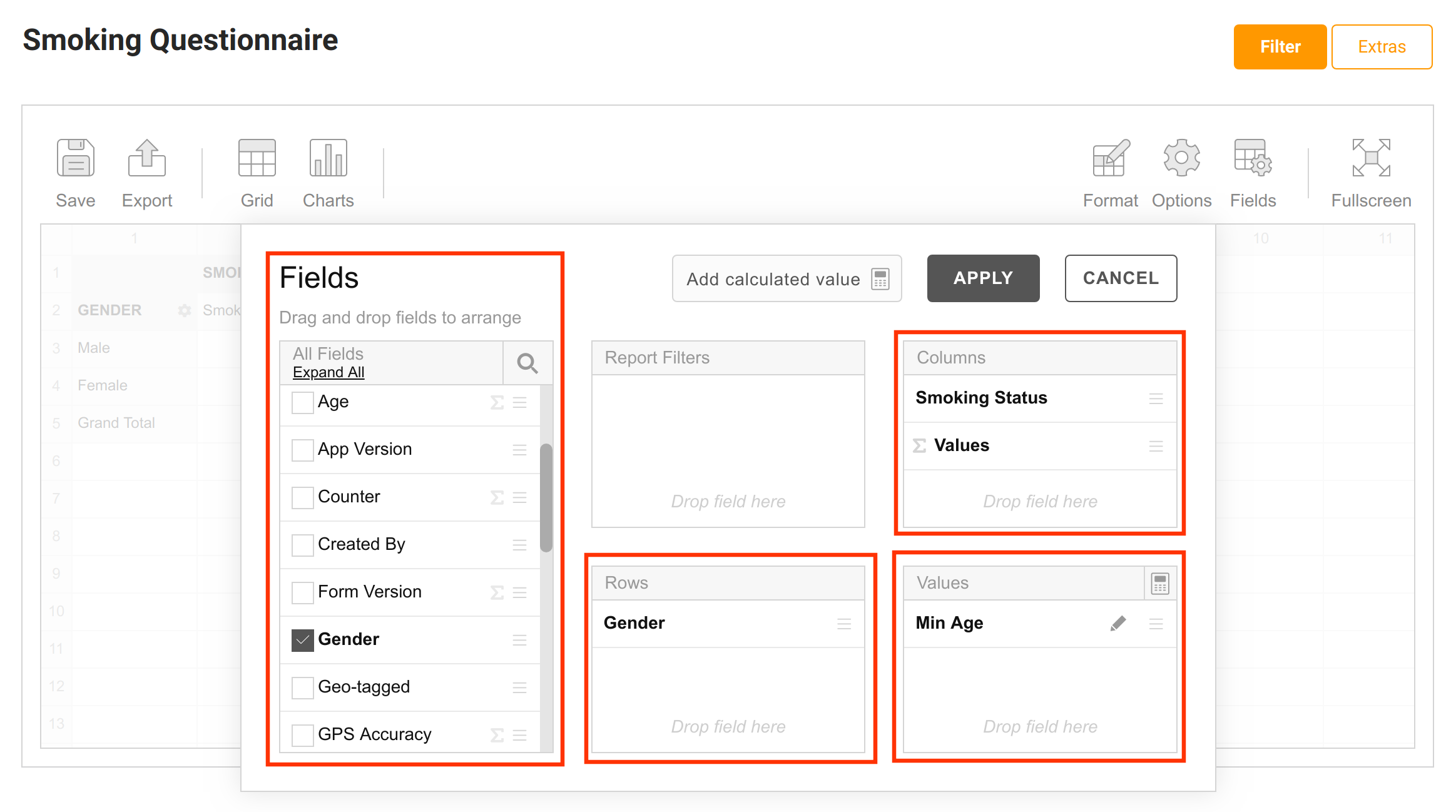
The Fields part of a pivot table is simply the list of all the variables in the dataset. Fields may be dragged from the fields list and dropped in any of the other 3 sections to create the desired data summary.
Of the 3 sections, only the Values section is mandatory. Remember from Part 1 that pivot tables summarize datasets based on measures. As such, it is measures that go into the values box because they form the basis for the summary.
Once the desired measure (or set of measures) has been placed in the Values section, the next step is to determine and set the aggregation function. The aggregation function is set in the Values section by simply clicking on a measure and choosing the desired function from the dropdown list.
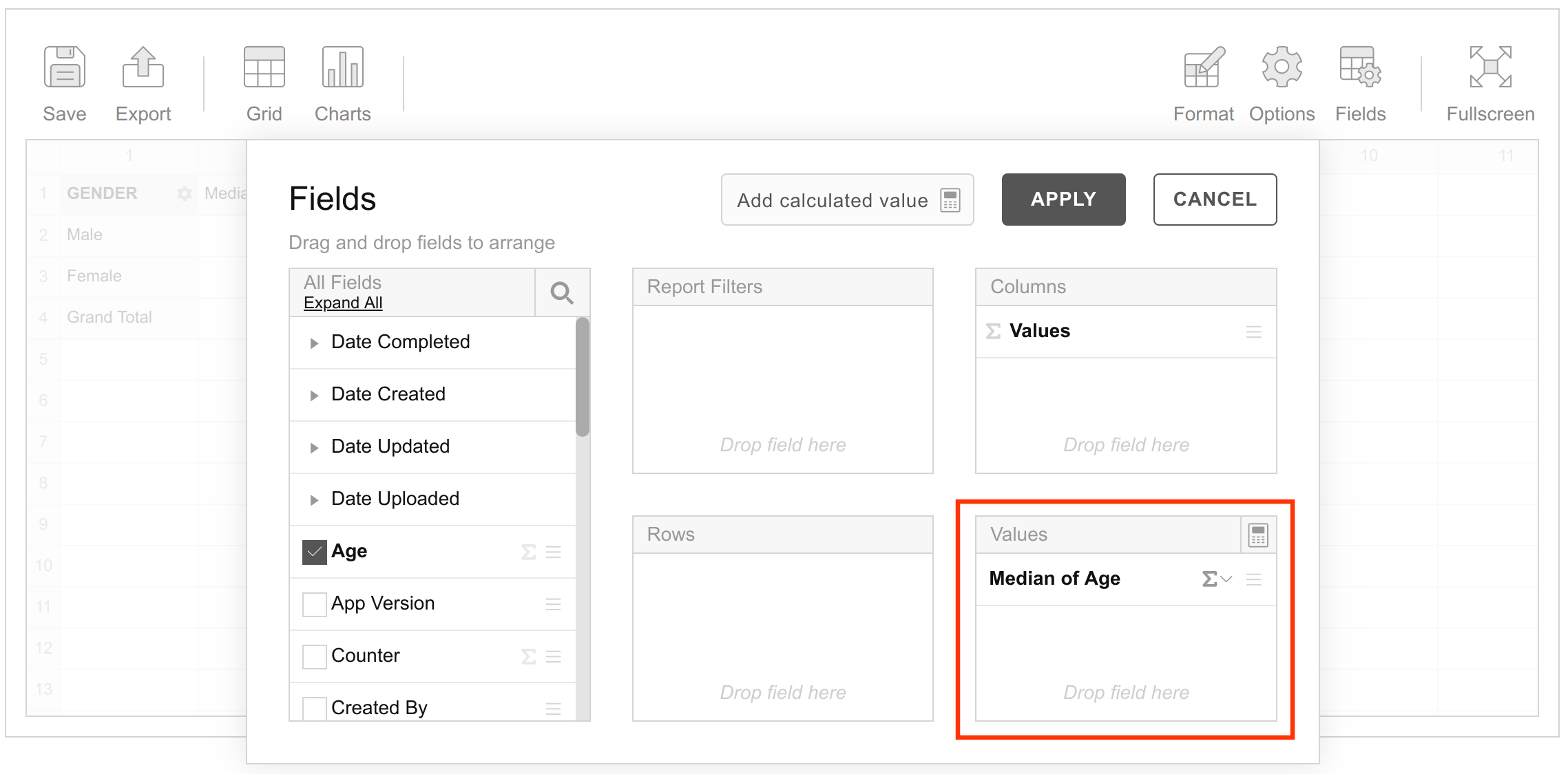
In this example, the age variable has been placed in the Values box with the aggregation function, Median.
Lastly, the Values label (appearing in the Columns section in the example above) must be placed either under Columns or under Rows. Where you place it determines how the resullting table will be oriented.
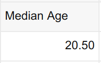
All that’s left now is to apply the settings and watch the magic happen.
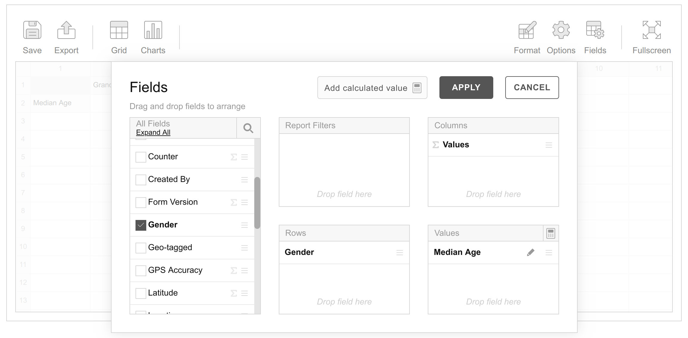
If the Values label were placed under Rows instead of Columns, then the summary table would pivoted so that it is oriented the other way as shown below.
![]()
This is actually why pivot tables are called pivot tables.
Now, this is a basic, dimensionless pivot table. In other words, it presents the median age of all students without disaggregating it by either Gender or Smoking Status.
Good, but not too interesting. So let’s jazz things up a little.
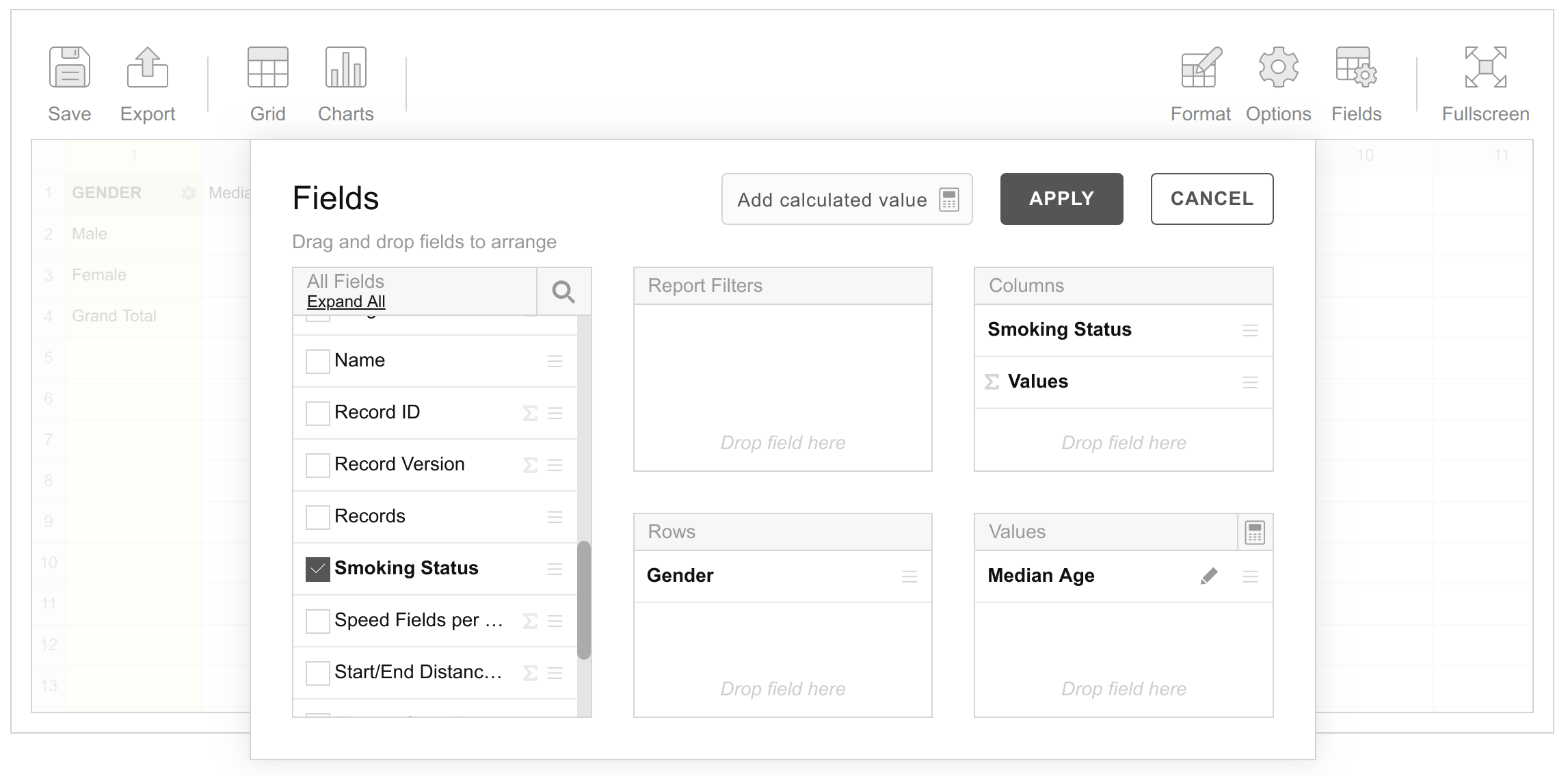
In this second example, we drag the Gender variable from the fields list and drop it in the Rows box, so that our configuration now looks like this.
Upon applying these settings we get the summary below.
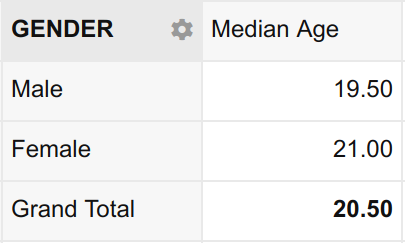
This is a lot more interesting now, as it includes the Gender dimension. Now not only can we see the median age of the entire sample, we can also see the median age of the male students and the median age of the female students.
As you can probably already guess, setting up a two-dimensional pivot table is as simple as placing the Smoking Status variable in the Columns box as shown below.
Once these settings are applied we get the following summary.
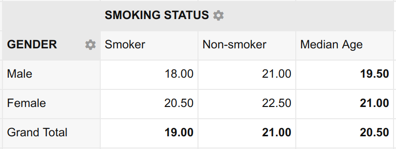
Voila! Now not only can we readily tell the median age of the entire sample (20.50), we can also tell:
- The median age of male students (19.50)
- The median age of female students (21.00)
- The median age of students who smoke (19.00)
- The median age of students who do not smoke (21.00)
- The median age of male students who smoke (18.00)
- The median age of male students who do not smoke (21.00)
- The median age of female students who smoke. (20.50)
- The median age of female students who do not smoke (22.50)
Notice that I merely chose to use the median aggregation as an example. A similar table can be prepared using a different aggregation e.g. Min.
Even more amazing is that various aggregations can be added at the same time. The configuration below, for example, contains 3 different aggregations on the Age variable i.e. Mean, Median and Min.
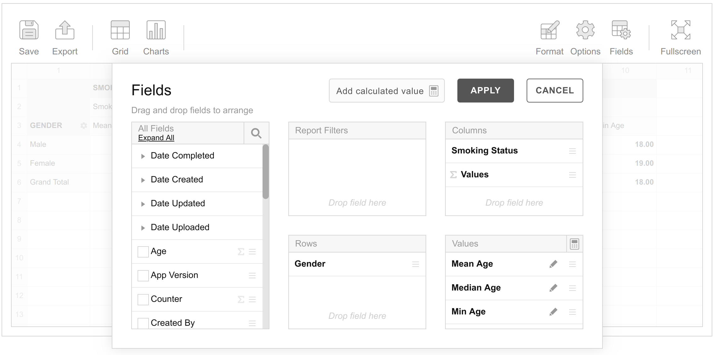
Once applied, this configuration yields the following summary table.
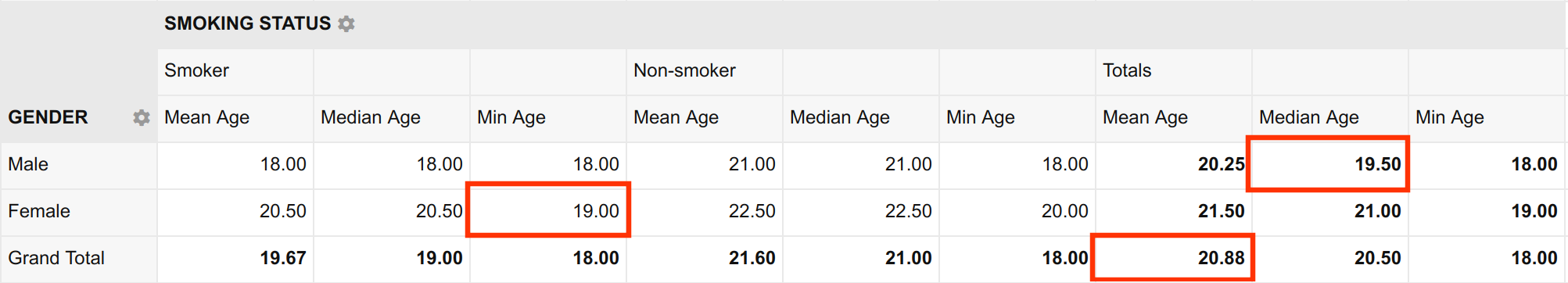
This particular pivot table is unnecessarily complicated. I do not recommend preparing one with so much information. But, it clearly demonstrates the power of pivot tables. Just one summary table and we can answer every single one of our questions from Part 1 – and then some.
- What is the mean age of the students? 20.88
- What is the median age of the male students? 19.50
- What is the minimum age of female students who smoke? 19
Conclusion
Pivot tables can do much more than this. For example, you can use them to create hierarchies of data with complex drill-down capability. You can also create charts from the summary tables, as well as introduce calculated variables that were not in the original dataset.
These things are beyond the scope of this series. But I hope that you find it useful as a basic introduction to pivot tables.
Before you go …
My name is Gitahi. I am the founder of Hoji. We are a leading provider of mobile data collection and analysis software for social and market research.
Our platform offers many outstanding features, one of which is an in-built pivot table. This, as you have seen, gives you plenty of options for summarising and understanding your dataset even before you download it for further statistical analysis.
I highly recommend that you try Hoji by downloading it from Play Store and filling out the Sample Form. I have also prepared a video that demonstrates just how easy it is to do everything I have covered in this tutorial using our platform. Click here to watch it.
If you enjoyed reading this series, please leave us your comments, questions or suggestions below.
Very well explained, thanks.
Thank you.
Very informative series on Pivot table thanks for sharing this