In the first part of this series, we discussed a few data summaries that can be a bit challenging to prepare. In this installment, we shall look at various pivot table configurations and how they can help answer the questions raised earlier more easily.
The first thing to understand about pivot tables is that they summarize data based on measurable quantities or measures. Measures are variables in a dataset that assume numeric values, for instance, Age.
Collections of numeric values like this can be summarized by applying aggregate functions. An aggregate function takes a set of numbers and produces a single value or summary statistic. Examples of aggregate functions include Sum, Mean and Median. Other examples are Min, Max, Standard deviation, Variance, Skewness and Kurtosis.
In Part 1, we saw that the first question in our example simply requires that we run the Average aggregate function on the Age variable.
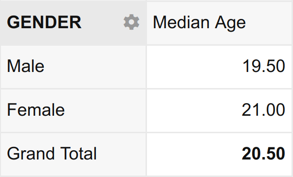
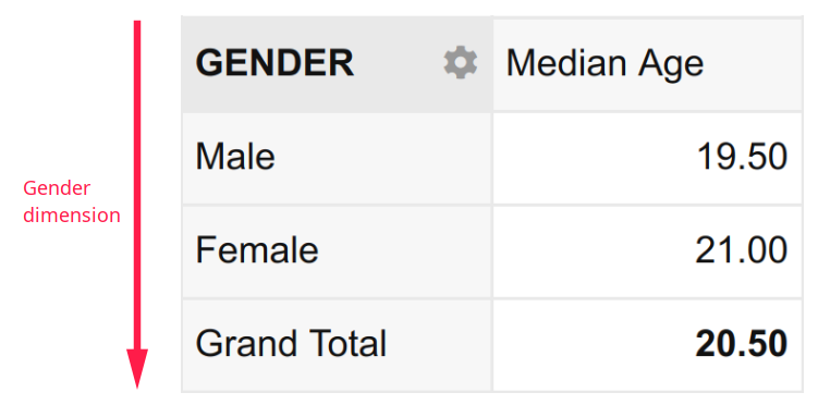
Similarly, the second question requires that we run the Median aggregate function on the Age variable. Importantly, however, it constrains this summary to only the part of the dataset where Gender equals Male. This idea of summarizing a numeric variable subject to the values of a categorical variable is called disaggregation.
In data analysis lingo, such a summary is described as “the median age disaggregated by gender”. The result is a table that looks like this:
Notice that aggregation means to take a set of values and collapse them into a single value. Disaggregation, on the other hand, means to take a set of values and split them into their constituent parts.
In the example above, the aggregating variable is Age (aggregated by applying the median function); and the disaggregating variable is Gender (disaggregated by splitting it into its constituent parts Male and Female).
Pivot tables aggregate data based on measurable quantities i.e. numeric variables. Conversely, they disaggregate data based on categorical variables. Thus pivot table summaries take the following forms:
- A
- A disaggregated by D
- A disaggregated by D1 and D2
Where A is an aggregating function on a numeric variable e.g. mean age and D is a disaggregating categorical variable e.g. Gender.
Now, this notation might seem a bit confusing at first, but hang on. It will be completely clear once you review the corresponding examples below.
- Mean age (A)
- Median age (A) disaggregated by Gender (D)
- Minimum age (A) disaggregated by Gender (D1) and Smoking Status (D2)
These expressions introduce the concept of dimensions.
Beginning with the first example, we can observe that the mean age is a single (scalar) value with no dimension. It is simply expressed as:
![]()
In the second example, the Median Age disaggregated by Gender has one dimension namely, Gender. It is expressed as:
In the third and final example, the Minimum Age disaggregated by Gender and Smoking Status has two dimensions namely, Gender and Smoking Status. It is expressed as:
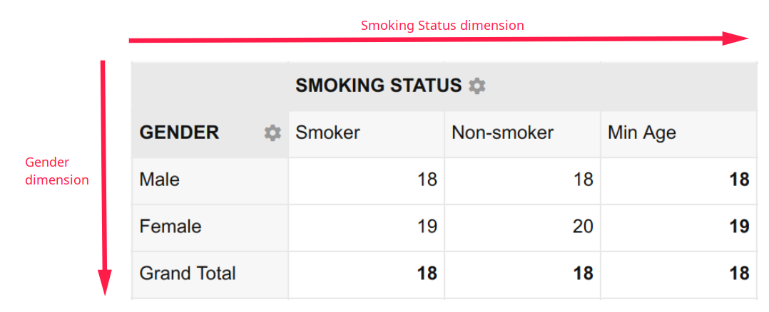
A two dimensional summary like this is called a cross-tabulation, crosstab or contingency table.
Notice that once prepared, each pivot table readily answers the coresponding question from Part 1.
- What is the mean age of the students? – 20.88
- What is the median age of the male students? – 19.50
- What is the minimum age of female students who smoke? – 19
But how exactly do you prepare tables like these? We shall answer this question in Part 3.
Click here to read Part 3. Or watch the video instead.